KISD.
Project Overview
Project Overview
KISD. is a skincare case study and prototype e-commerce website created for a User Interaction Design class. The project outline involved completing research and conceptual design collaboratively and using the findings to inform the individual design of a 5-page interactive e-commerce prototype made on Axure RP 11, KISD.
KISD. is a skincare case study and prototype e-commerce website created for a User Interaction Design class. The project outline involved completing research and conceptual design collaboratively and using the findings to inform the individual design of a 5-page interactive e-commerce prototype made on Axure RP 11, KISD.
KISD. is a skincare case study and prototype e-commerce website created for a User Interaction Design class. The project outline involved completing research and conceptual design collaboratively and using the findings to inform the individual design of a 5-page interactive e-commerce prototype made on Axure RP 11, KISD.
Discipline
Discipline
UX/UI Design
My Role
My Role
Collaborative UX researcher
UI Designer
Deliverables
Deliverables
5-page e-commerce prototype
Time Frame
Time Frame
13 weeks


Introducing KISD.
Introducing KISD.
Introducing KISD.
Skincare is a deeply personal topic, and it can be difficult for users to have a positive shopping experience due to this. Many skincare websites don’t offer users the opportunity to accurately discover and purchase the products that will be effective for them, which can be overwhelming and result in user frustration. KISD. was created in response to this issue.
Skincare is a deeply personal topic, and it can be difficult for users to have a positive shopping experience due to this. Many skincare websites don’t offer users the opportunity to accurately discover and purchase the products that will be effective for them, which can be overwhelming and result in user frustration. KISD. was created in response to this issue.
Opportunities
Opportunities
Opportunities
Creating a personalised user shopping experience through interactive features such as product comparison.
Creating a personalised user shopping experience through interactive features such as product comparison.
Creating a personalised user shopping experience through interactive features such as product comparison.
Establishing a realistic and targeted brand identity.
Establishing a realistic and targeted brand identity.
Establishing a realistic and targeted brand identity.
Including unnecessary but effective user interactions to help users navigate and locate information with ease.
Including unnecessary but effective user interactions to help users navigate and locate information with ease.
Including unnecessary but effective user interactions to help users navigate and locate information with ease.
Constraints
Constraints
Constraints
Every user has different needs, so personalisation may be difficult to achieve.
Every user has different needs, so personalisation may be difficult to achieve.
Users will have expectations for how a skincare e-commerce site should look and function.
Users will have expectations for how a skincare e-commerce site should look and function.
Users will have expectations for how a skincare e-commerce site should look and function.
The prioritisation of customisation in the prototype may confuse users if they are unfamiliar with such features.
The prioritisation of customisation in the prototype may confuse users if they are unfamiliar with such features.
The prioritisation of customisation in the prototype may confuse users if they are unfamiliar with such features.
Research and Discovery
Research and Discovery
Research and Discovery
Online Survey
Online Survey
Online Survey
The first step taken when gathering user data was creating a collaborative group survey through Google Forms, which was sent out to various university students to complete. Doing so allowed us to understand the current skincare shopping preferences of 42 potential users.
The first step taken when gathering user data was creating a collaborative group survey through Google Forms, which was sent out to various university students to complete. Doing so allowed us to understand the current skincare shopping preferences of 42 potential users.
Survey Results
Survey Results
Survey Results

Key Takeaways
Key Takeaways
Key Takeaways
Many users make purchase decisions on the basis of product effectiveness, determined through the listed benefits of a product and product reviews.
Many users make purchase decisions on the basis of product effectiveness, determined through the listed benefits of a product and product reviews.
Many users make purchase decisions on the basis of product effectiveness, determined through the listed benefits of a product and product reviews.
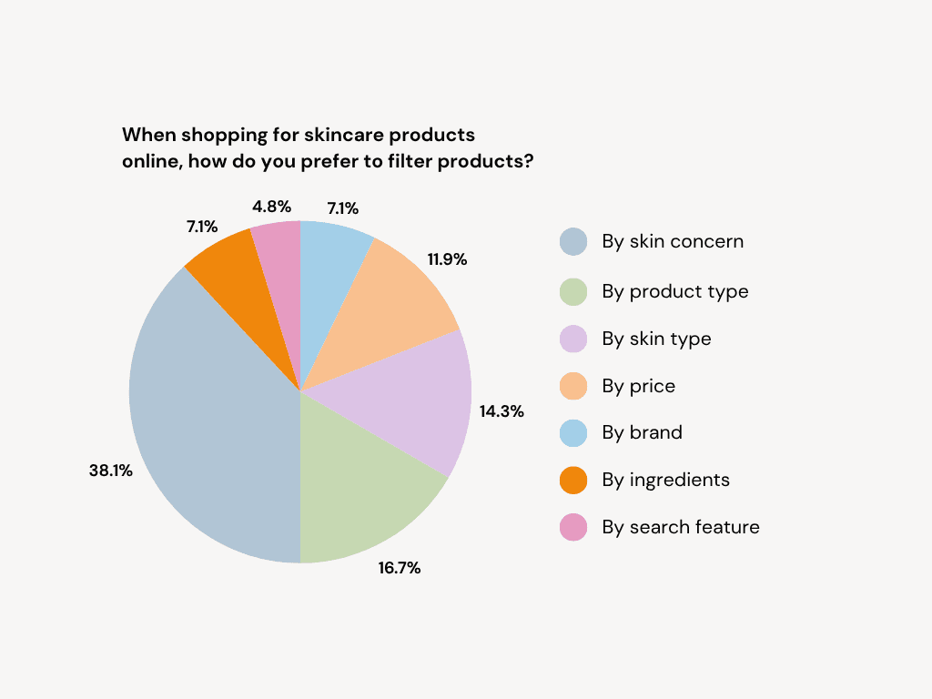
38.1% of users shop for products by skin concern; however, all methods of filtering products were highly valued in general.
38.1% of users shop for products by skin concern; however, all methods of filtering products were highly valued in general.
38.1% of users shop for products by skin concern; however, all methods of filtering products were highly valued in general.
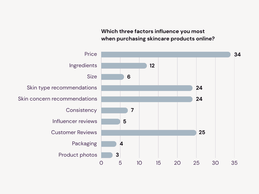
Price (34), customer reviews (25), and skin type/concern recommendations (24) are the most influential factors for users when buying skincare products online.
Price (34), customer reviews (25), and skin type/concern recommendations (24) are the most influential factors for users when buying skincare products online.
Price (34), customer reviews (25), and skin type/concern recommendations (24) are the most influential factors for users when buying skincare products online.
User Interviews
User Interviews
User Interviews
The results of the online survey were used to inform the questions asked in a user interview. A semi-structured interview was conducted on a 21-year-old student, asking a small selection of questions and using the answers to guide the interview.
The interview was audio recorded with the subject's permission.
Goals
Goals
Goals
To learn how users currently research products when making skincare purchase decisions.
To learn how users currently research products when making skincare purchase decisions.
To learn how users currently research products when making skincare purchase decisions.
To understand what information users value on a skincare product listing page.
To understand what information users value on a skincare product listing page.
To understand what information users value on a skincare product listing page.
To understand the main factors that users consider when making skincare purchase decisions.
To understand the main factors that users consider when making skincare purchase decisions.
To understand the main factors that users consider when making skincare purchase decisions.
Key Takeaways
Key Takeaways
Key Takeaways
A minimalistic website design that is simple to use and understand is expected.
A minimalistic website design that is simple to use and understand is expected.
A minimalistic website design that is simple to use and understand is expected.
A skincare website should provide all necessary product details and allow users a simple way to compare products.
A skincare website should provide all necessary product details and allow users a simple way to compare products.
A skincare website should provide all necessary product details and allow users a simple way to compare products.
Their current process for making skincare purchase decisions is through opening multiple product pages in separate tabs and researching each product individually.
Their current process for making skincare purchase decisions is through opening multiple product pages in separate tabs and researching each product individually.
Their current process for making skincare purchase decisions is through opening multiple product pages in separate tabs and researching each product individually.
Observations
Observations
Observations
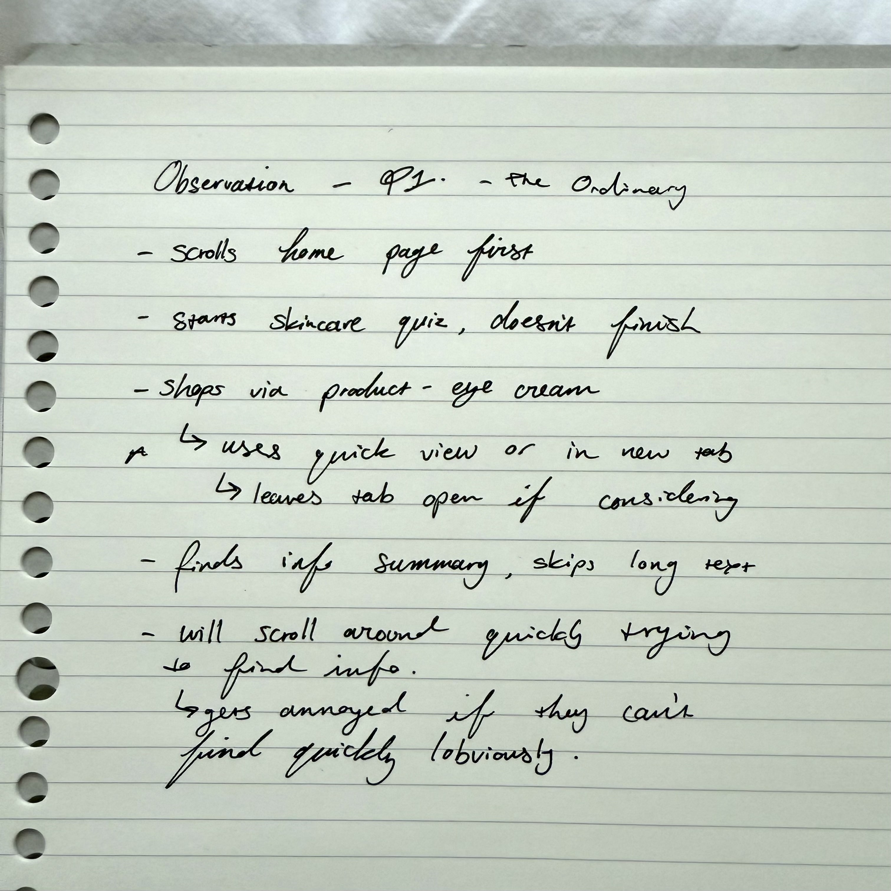
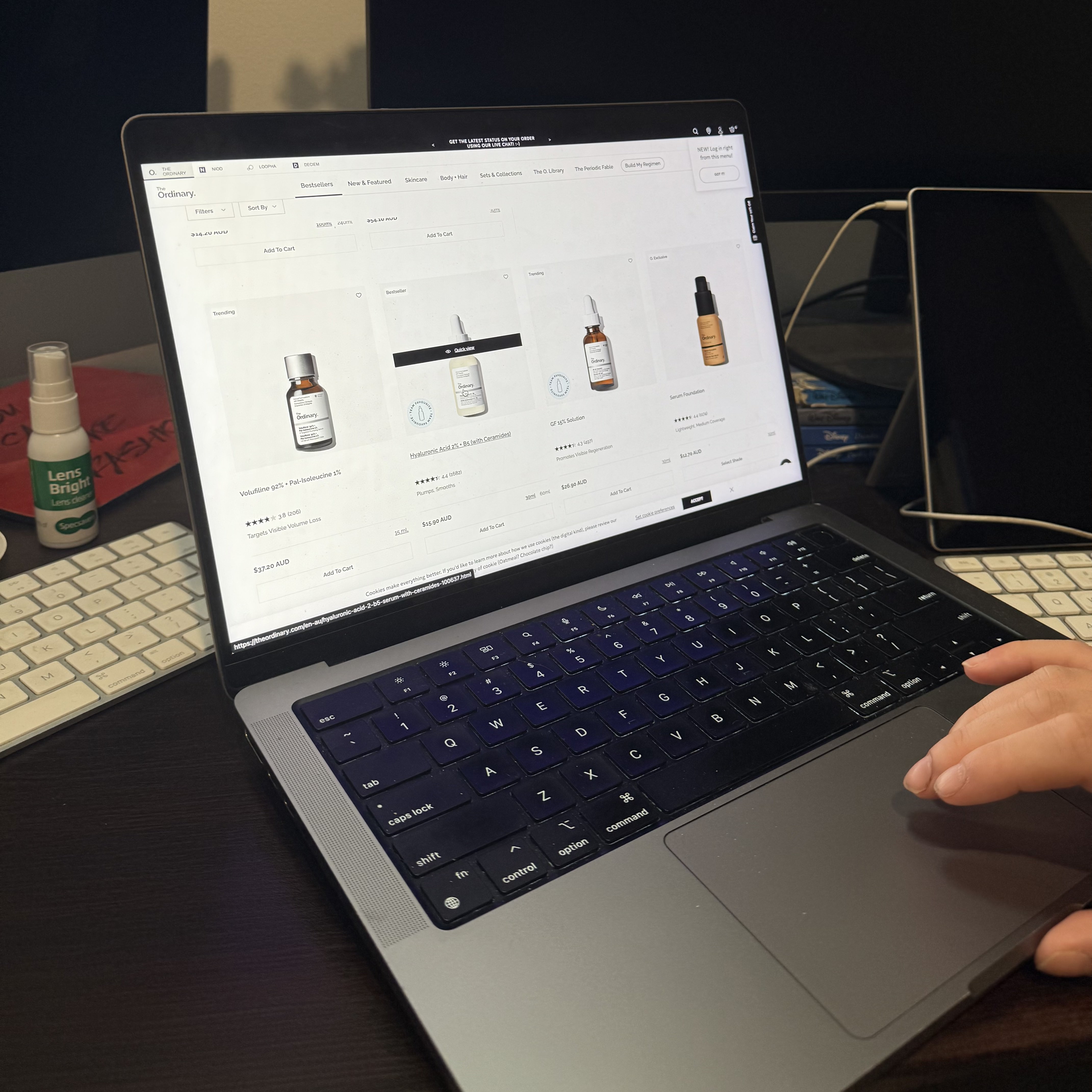
To better understand user behaviours when navigating e-commerce sites, I tasked my interview participant with navigating a popular skincare brand's website, tasking them with locating a product that suits their current needs. This session was recorded and later transcribed with the participant's consent.
To better understand user behaviours when navigating e-commerce sites, I tasked my interview participant with navigating a popular skincare brand's website, tasking them with locating a product that suits their current needs. This session was recorded and later transcribed with the participant's consent.
Key Takeaways
Key Takeaways
Key Takeaways
Users prioritise seeing summarised information over long slabs of text.
Users prioritise seeing summarised information over long slabs of text.
Users prioritise seeing summarised information over long slabs of text.
Users prefer disposable ways of viewing products, such as opening a quick view or opening a product in a new tab.
Users prefer disposable ways of viewing products, such as opening a quick view or opening a product in a new tab.
Users prefer disposable ways of viewing products, such as opening a quick view or opening a product in a new tab.
Users often get distracted when completing questionnaires, leaving them incomplete.
Users often get distracted when completing questionnaires, leaving them incomplete.
Users often get distracted when completing questionnaires, leaving them incomplete.
Research Findings
Research Findings
Research Findings
Findings from each research method allowed me to highlight three key features that my e-commerce prototype should include for it to address user's needs and online skincare shopping habits.
Findings from each research method allowed me to highlight three key features that my e-commerce prototype should include for it to address user's needs and online skincare shopping habits.
Key Takeaways
Key Takeaways
Key Takeaways
Including a product comparison feature will greatly aid users in making purchase decisions.
Including a product comparison feature will greatly aid users in making purchase decisions.
Including a product comparison feature will greatly aid users in making purchase decisions.
Users should be provided with all product information in a simple way that reduces research time.
Users should be provided with all product information in a simple way that reduces research time.
Users should be provided with all product information in a simple way that reduces research time.
All categories of filtering are valued by users, therefore, users should be supplied with various methods of filtering products, creating an experience that will suit all user needs.
All categories of filtering are valued by users, therefore, users should be supplied with various methods of filtering products, creating an experience that will suit all user needs.
All categories of filtering are valued by users, therefore, users should be supplied with various methods of filtering products, creating an experience that will suit all user needs.
Further results and findings have been summarised through a user persona, collaborative affinity diagramming and various journey mapping, all of which were used to identify user needs, pain points, and possible solutions for these.
Further results and findings have been summarised through a user persona, collaborative affinity diagramming and various journey mapping, all of which were used to identify user needs, pain points, and possible solutions for these.
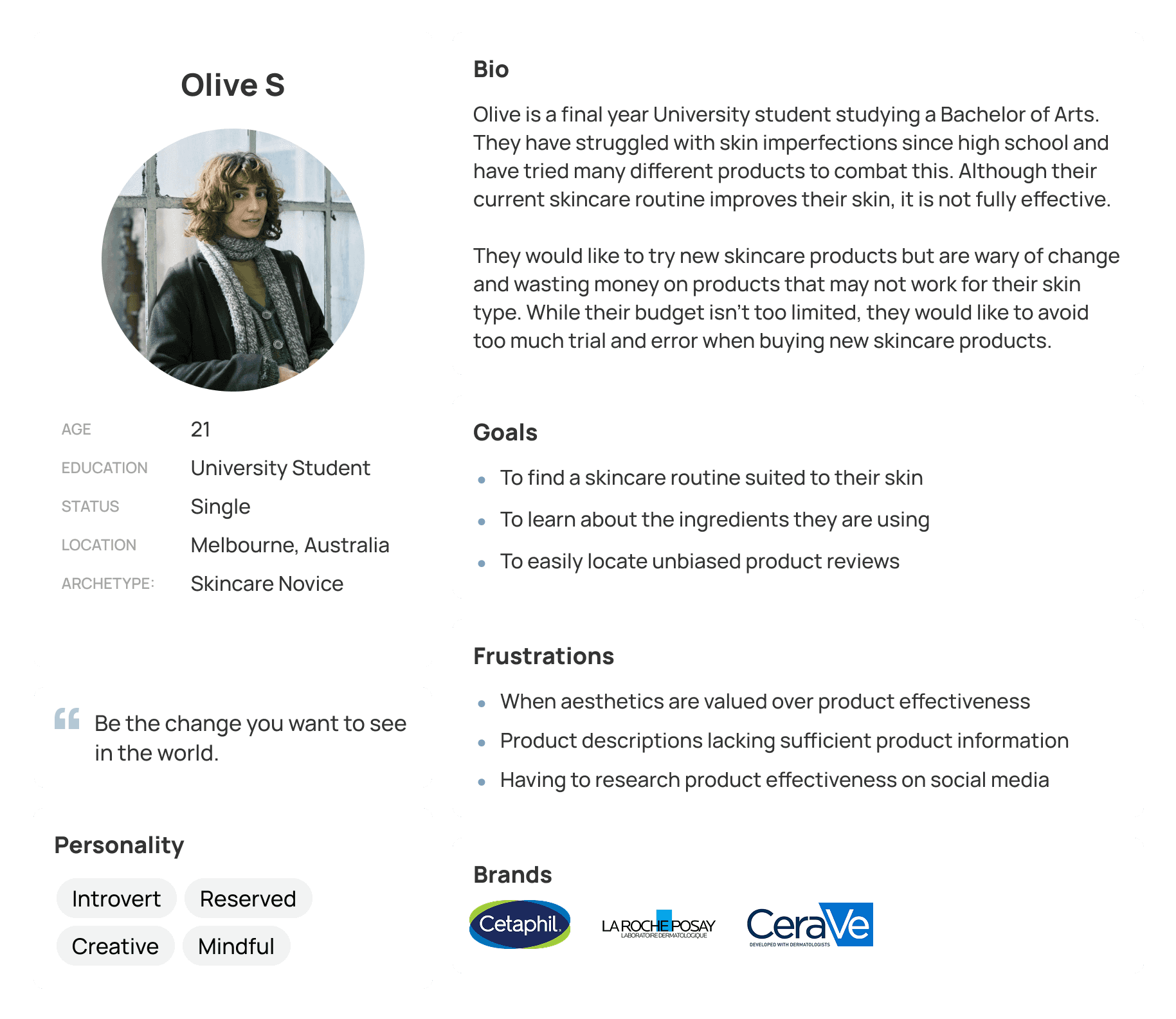
User Persona
User Persona
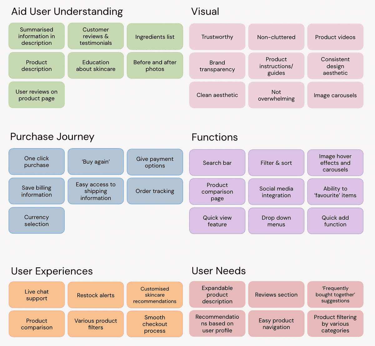
Affinity Diagramming
Affinity Diagramming
Activity Diagram
Activity Diagram

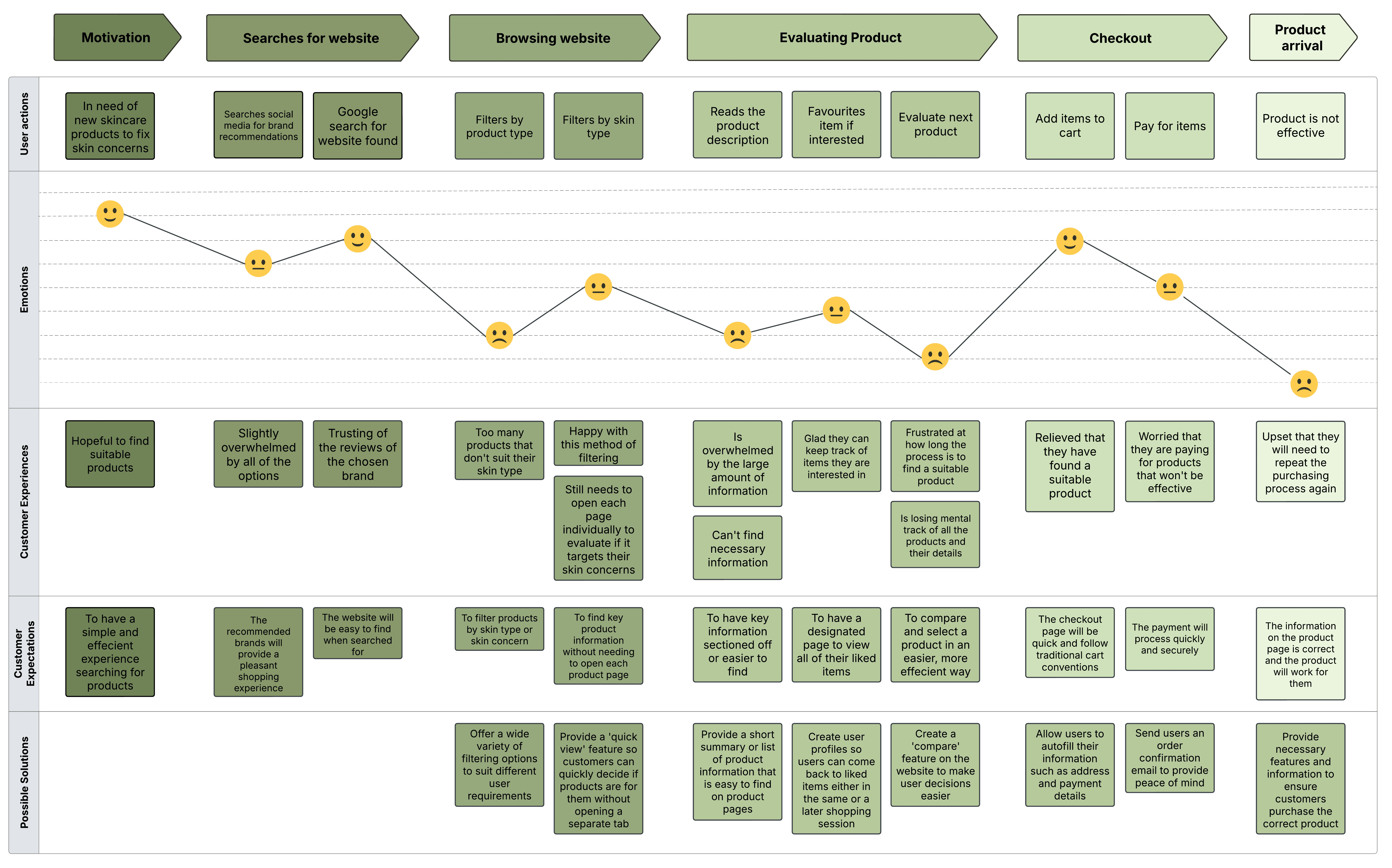
Journey Map
Journey Map
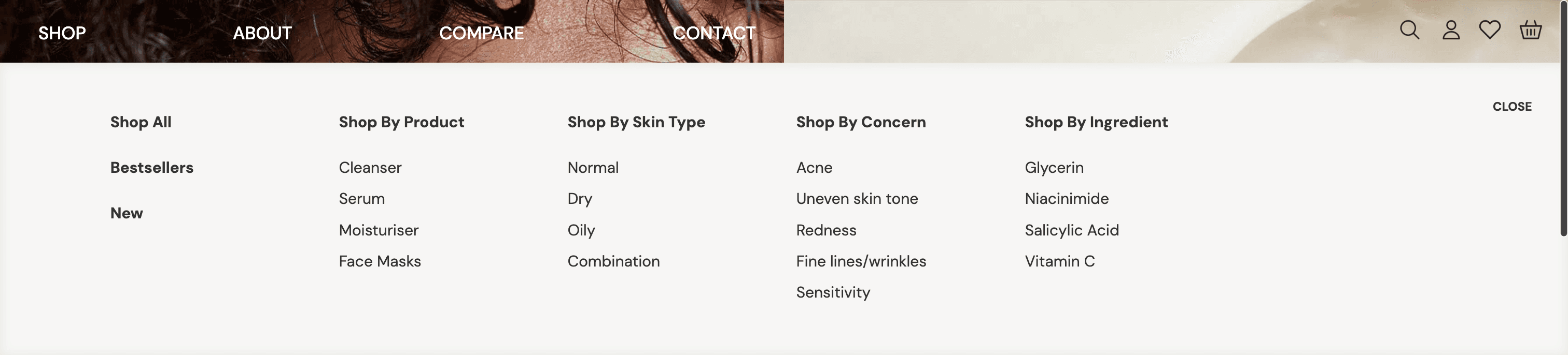
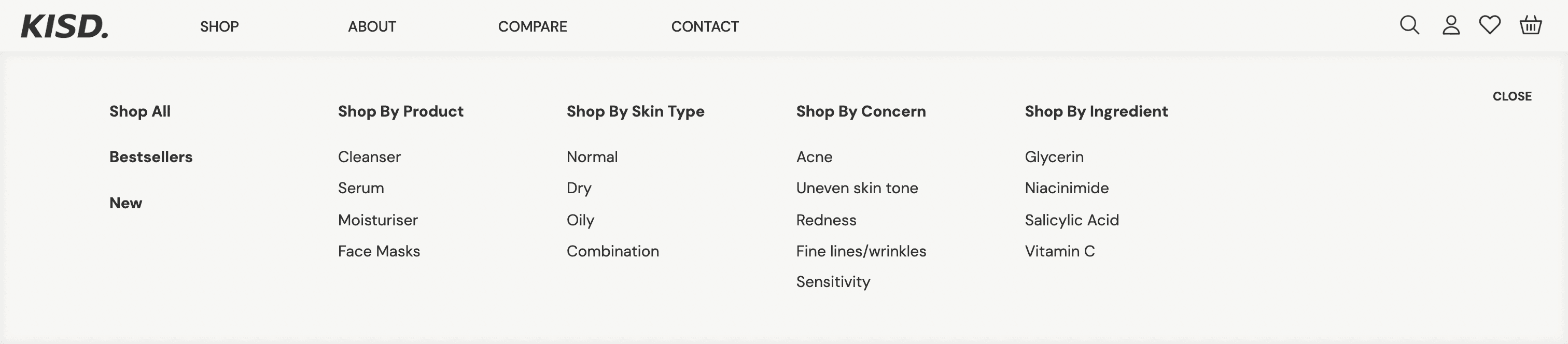
Information Architecture
Information Architecture
Information Architecture
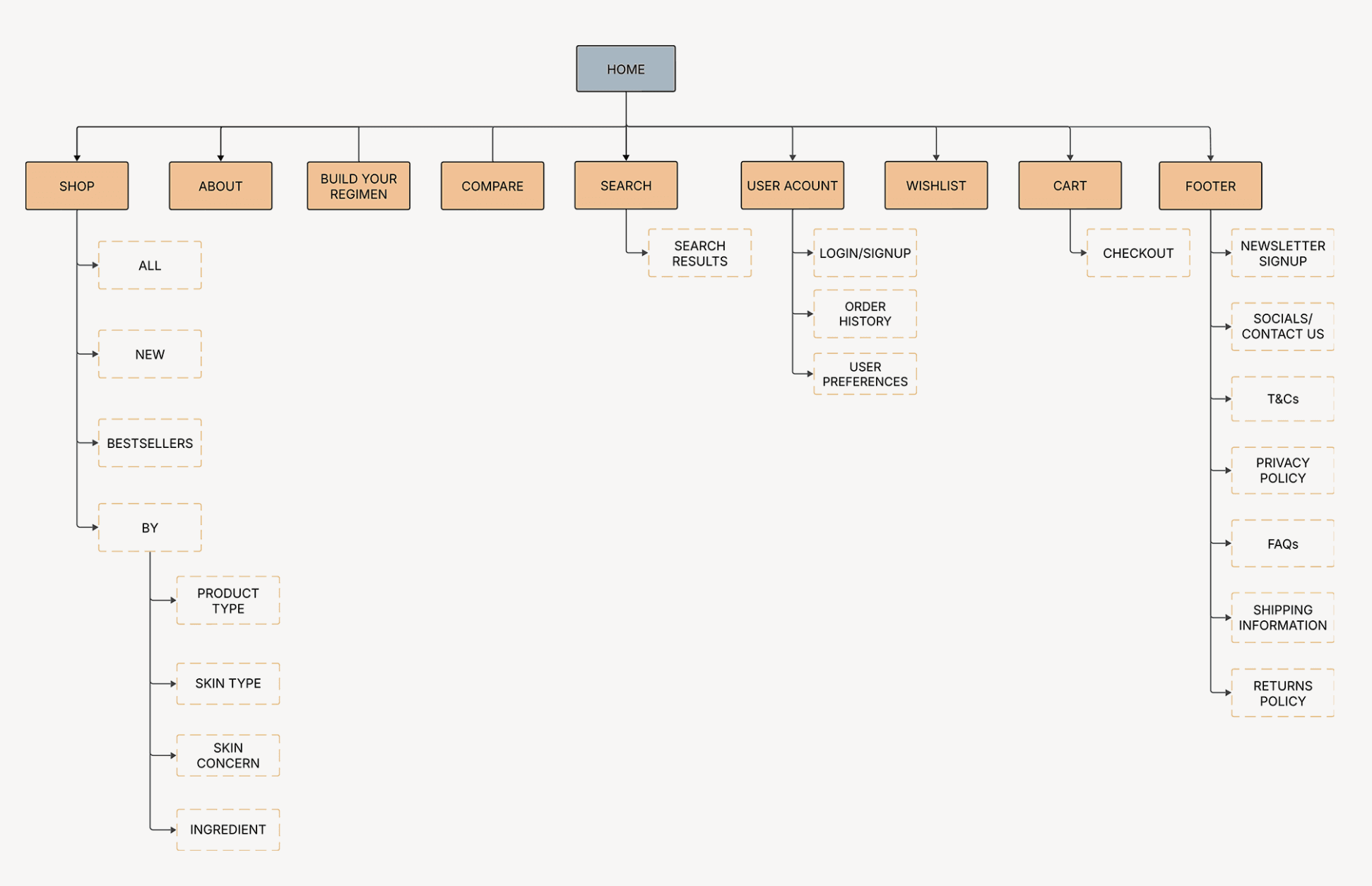
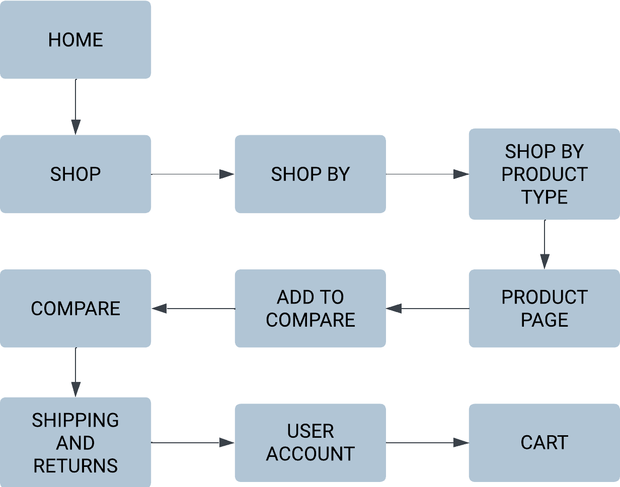
Results retrieved from the user survey and affinity diagramming helped to inform the creation of a site map that outlines the pages and information users require to have a successful online shopping experience. Furthermore, I was able to create a user flow derived from my activity diagram, informing the design of navigation flows within my prototype.
Results retrieved from the user survey and affinity diagramming helped to inform the creation of a site map that outlines the pages and information users require to have a successful online shopping experience. Furthermore, I was able to create a user flow derived from my activity diagram, informing the design of navigation flows within my prototype.
Site Map
Site Map
User Flow
User Flow
Wireframing
Wireframing
Wireframing
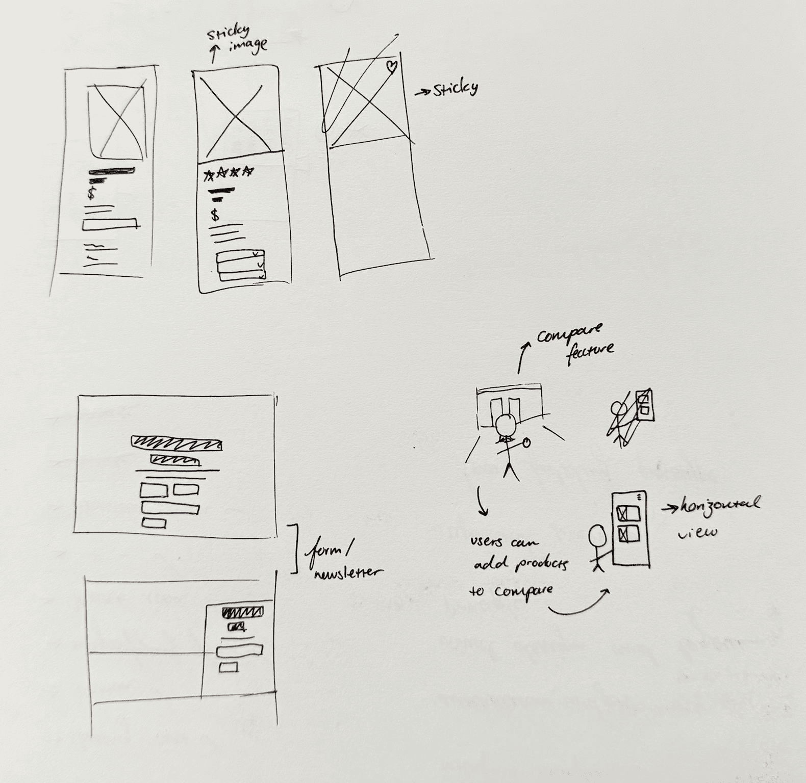
Wireframe Sketches
Wireframe Sketches
Wireframe Sketches
Before designing low fidelity wireframes for KISD, I roughly sketched the wireframes of key pages and features that the prototype would include. These sketches were used as a basis for the design of low fidelity wireframes, informing design decisions such as layout and user interactivity features.
Before designing low fidelity wireframes for KISD, I roughly sketched the wireframes of key pages and features that the prototype would include. These sketches were used as a basis for the design of low fidelity wireframes, informing design decisions such as layout and user interactivity features.

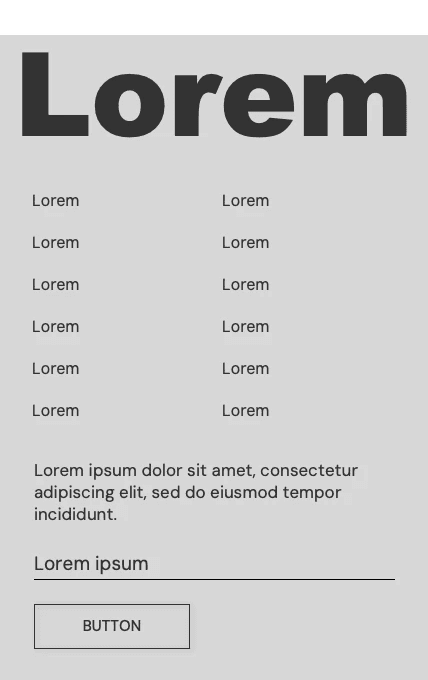
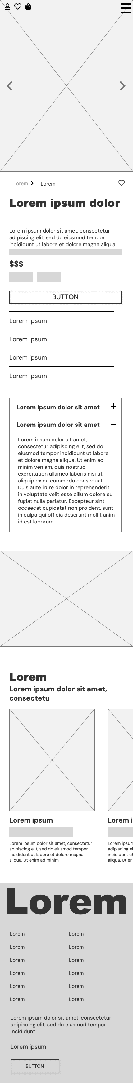
Low Fidelity Wireframes
Low Fidelity Wireframes
Low Fidelity Wireframes
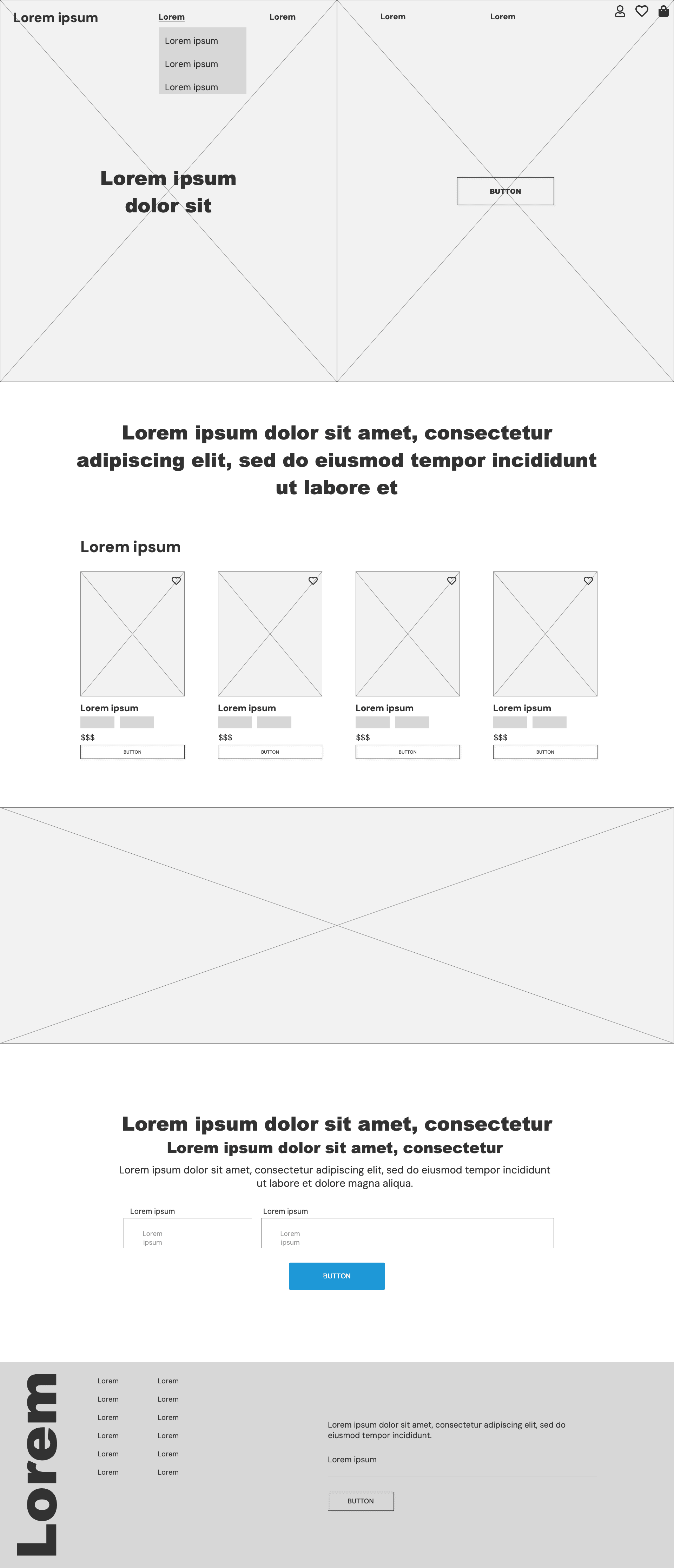
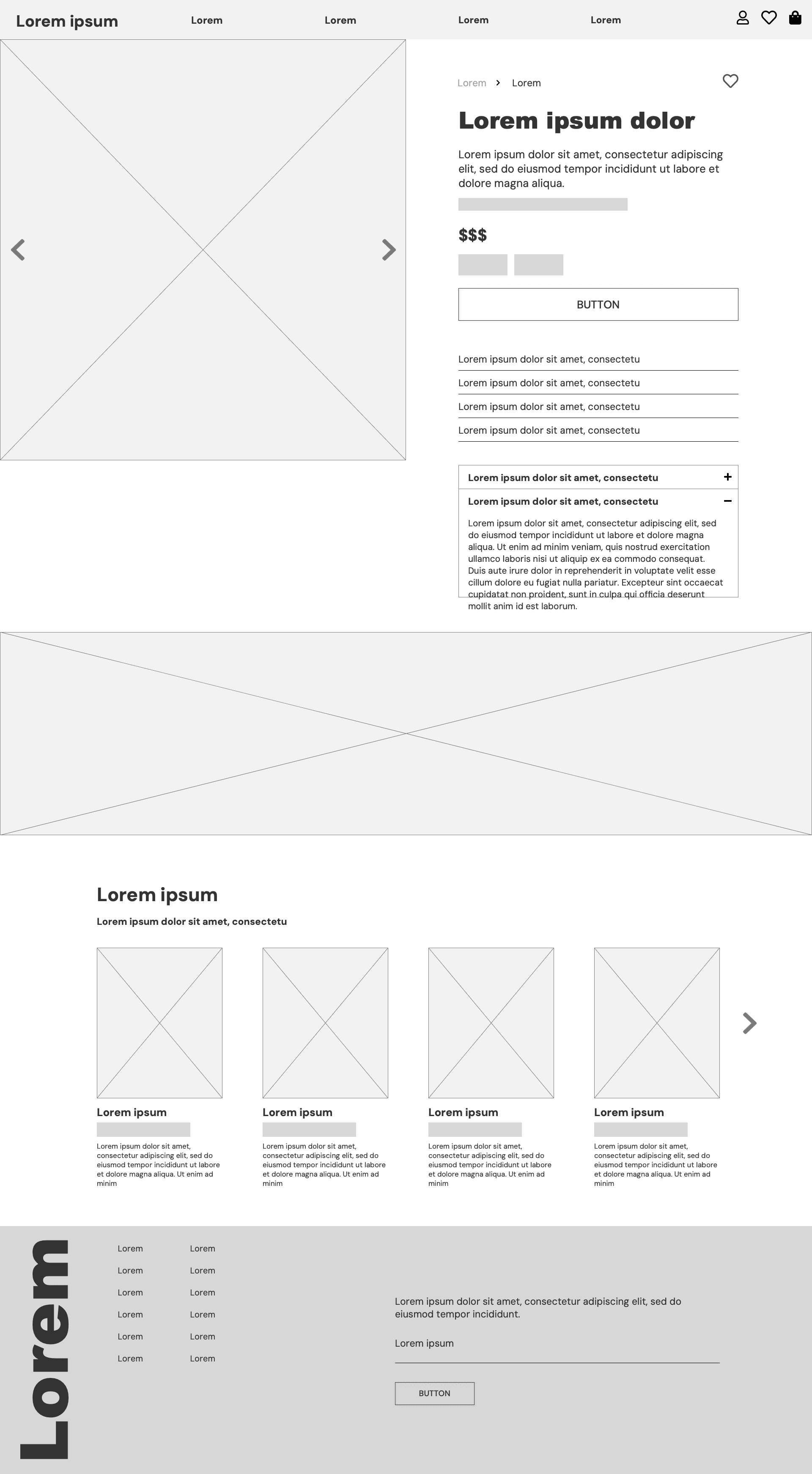
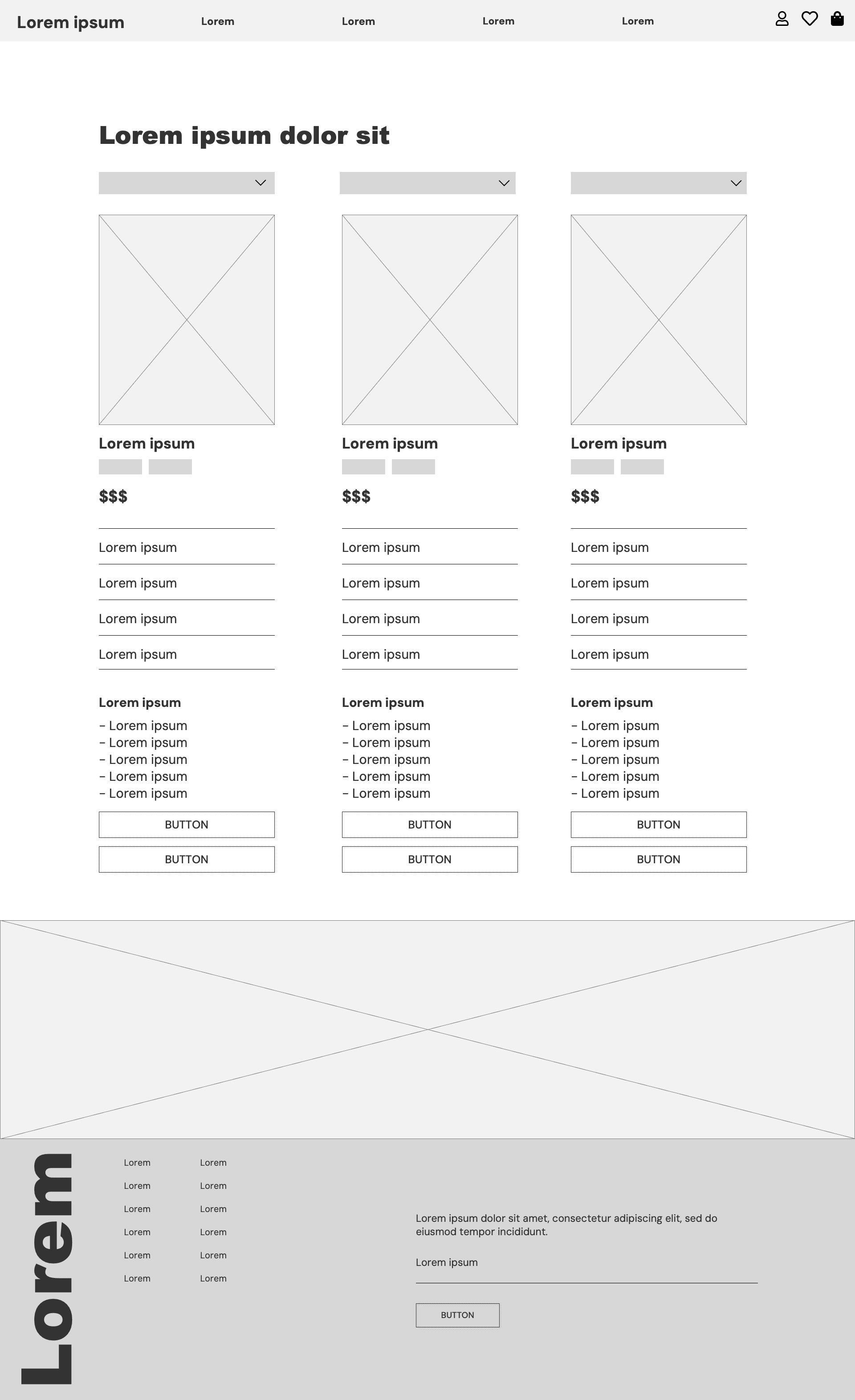
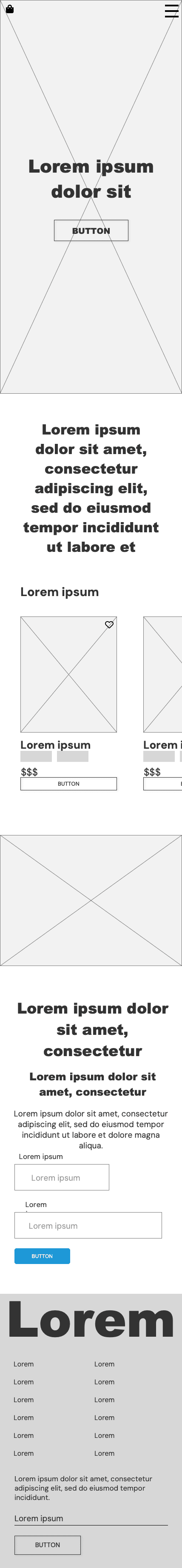
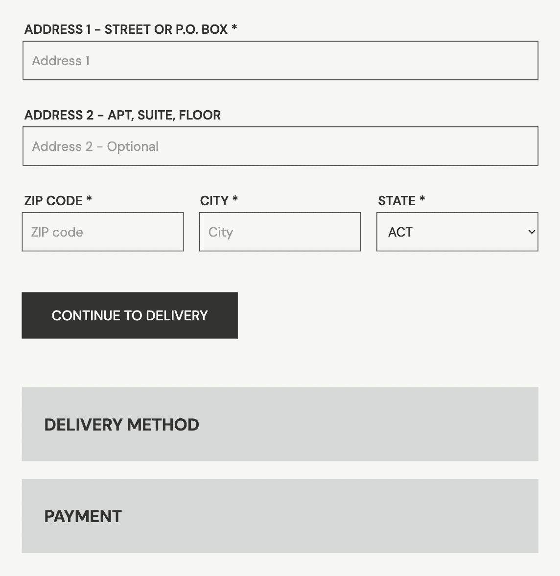
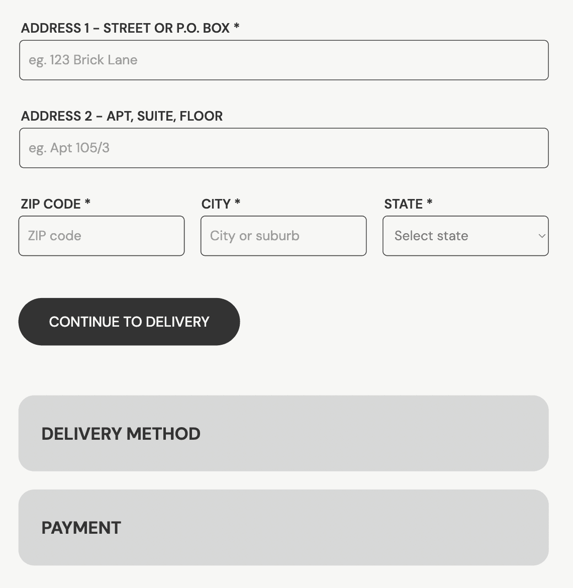
Building from the sketches of key prototype elements, full low fidelity wireframes for key prototype pages were designed using Axure RP. These wireframes include placeholders for images and text and showcase the designs and layouts of site navigation, product cards, buttons, newsletter signups, product information, product comparison and more.
Designing these wireframes helped in informing design changes, too, as I was able to identify and change the design of features that were ineffective, such as the design of drop-down menus and product filters.
Low fidelity wireframes - Desktop
Low fidelity wireframes - Desktop
Low fidelity wireframes - Desktop
Home
Home
Home
Shop all
Shop all
Shop all
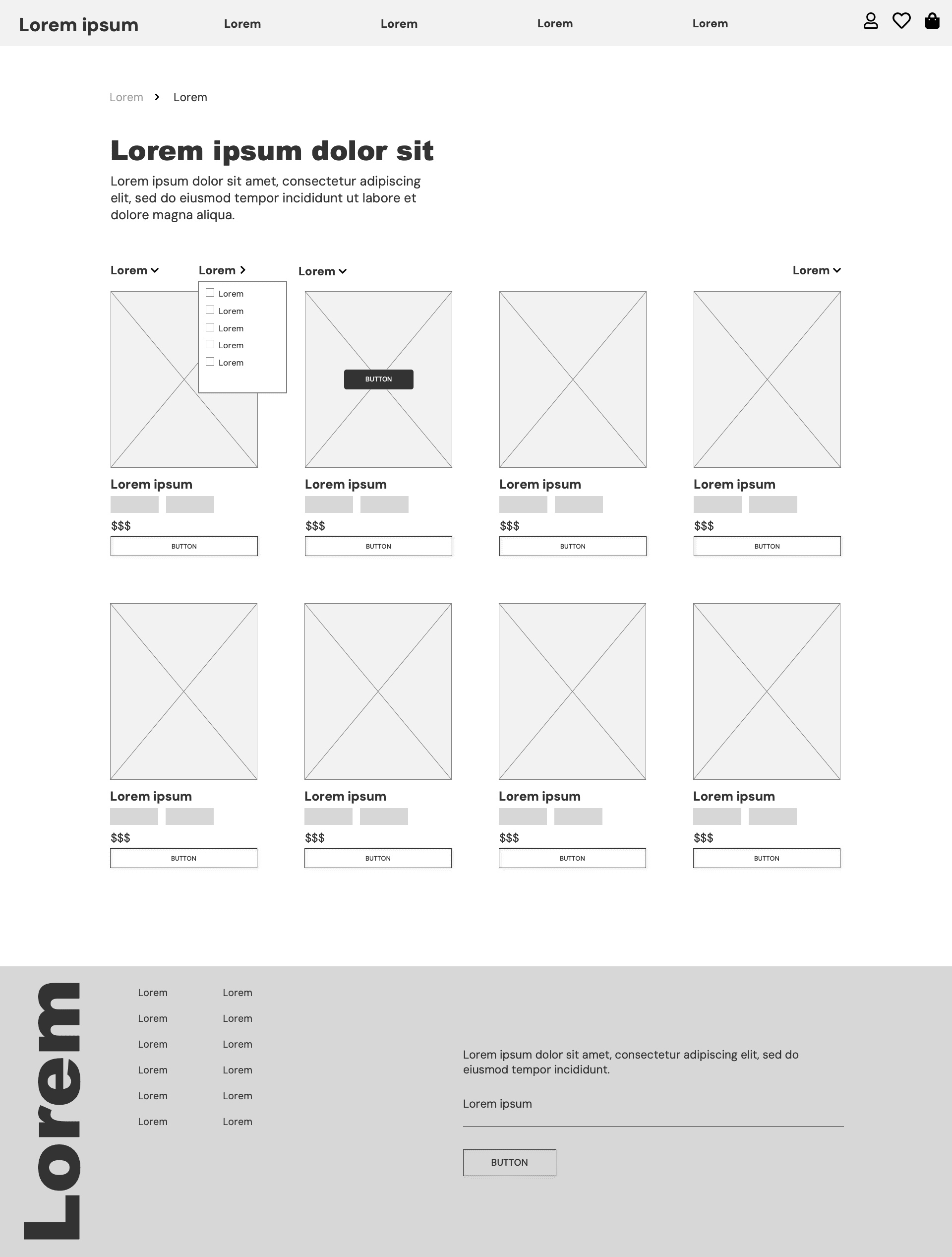
Product page
Product page
Product page
Compare
Compare
Compare
Low fidelity wireframes - Mobile
Low fidelity wireframes - Mobile
Low fidelity wireframes - Mobile
Home
Home
Home
Shop all
Shop all
Shop all

Product page
Product page
Product page
Compare
Compare
Compare

Designing KISD.
Designing KISD.
Designing KISD.
Branding and Naming
Branding and Naming
Branding and Naming
The naming for KISD. is inspired by the word 'sunkissed', a phrase used to describe somebody with a light tan or glow. Not only does this infer that KISD's products will make you glow, but it also has an upbeat, summer-like energy that matches the brand identity. This is reflected in my colour palette and imagery used.
Employing youthful and lively branding for KISD. helps to make the website more approachable for users with a lower understanding of skincare websites, who may feel intimidated by a more sophisticated or scientific branding approach.
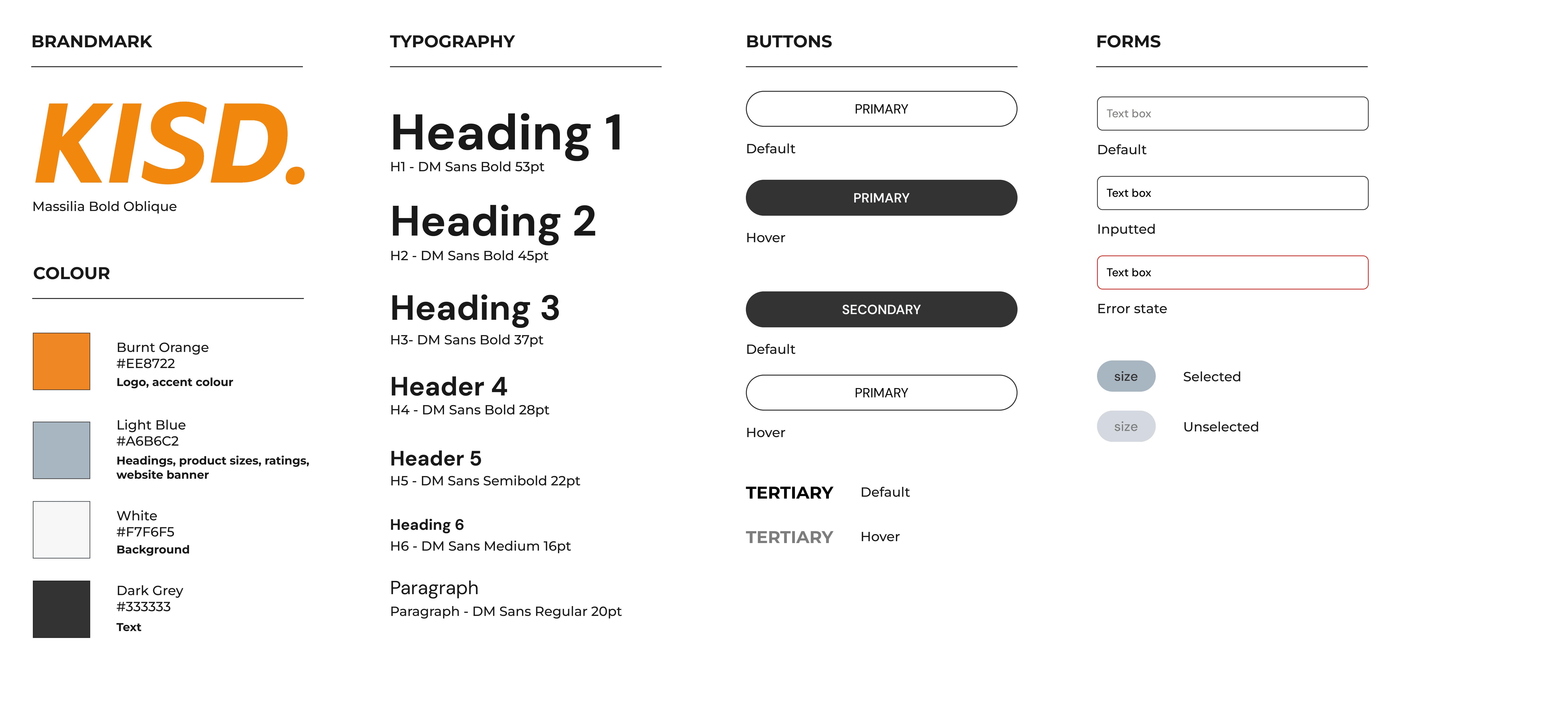
Design System
Design System
Design System
First Design Iteration
First Design Iteration
First Design Iteration
Combining the KISD. branding with low fidelity wireframe designs, I created the first desktop design iterations for KISD. Additional cart and checkout pages were designed in this stage due to clarifications in the brief.
Combining the KISD. branding with low fidelity wireframe designs, I created the first desktop design iterations for KISD. Additional cart and checkout pages were designed in this stage due to clarifications in the brief.
First Design Iteration - Desktop
First Design Iteration - Desktop
First Design Iteration - Desktop
Home
Home
Home
Shop all
Shop all
Shop all

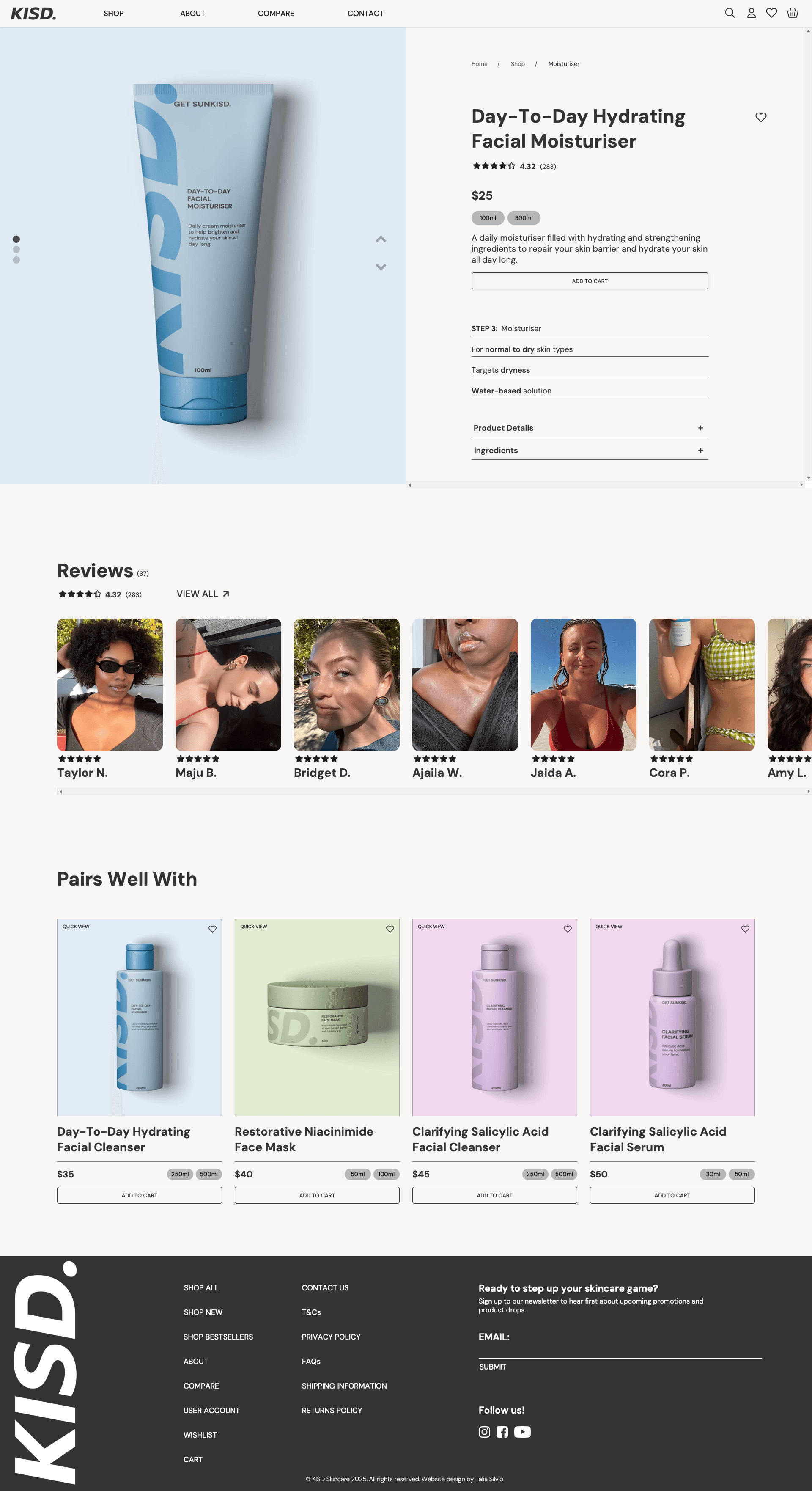
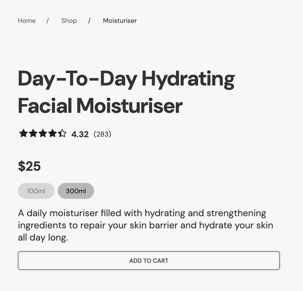
Product page
Product page
Compare
Compare
Compare

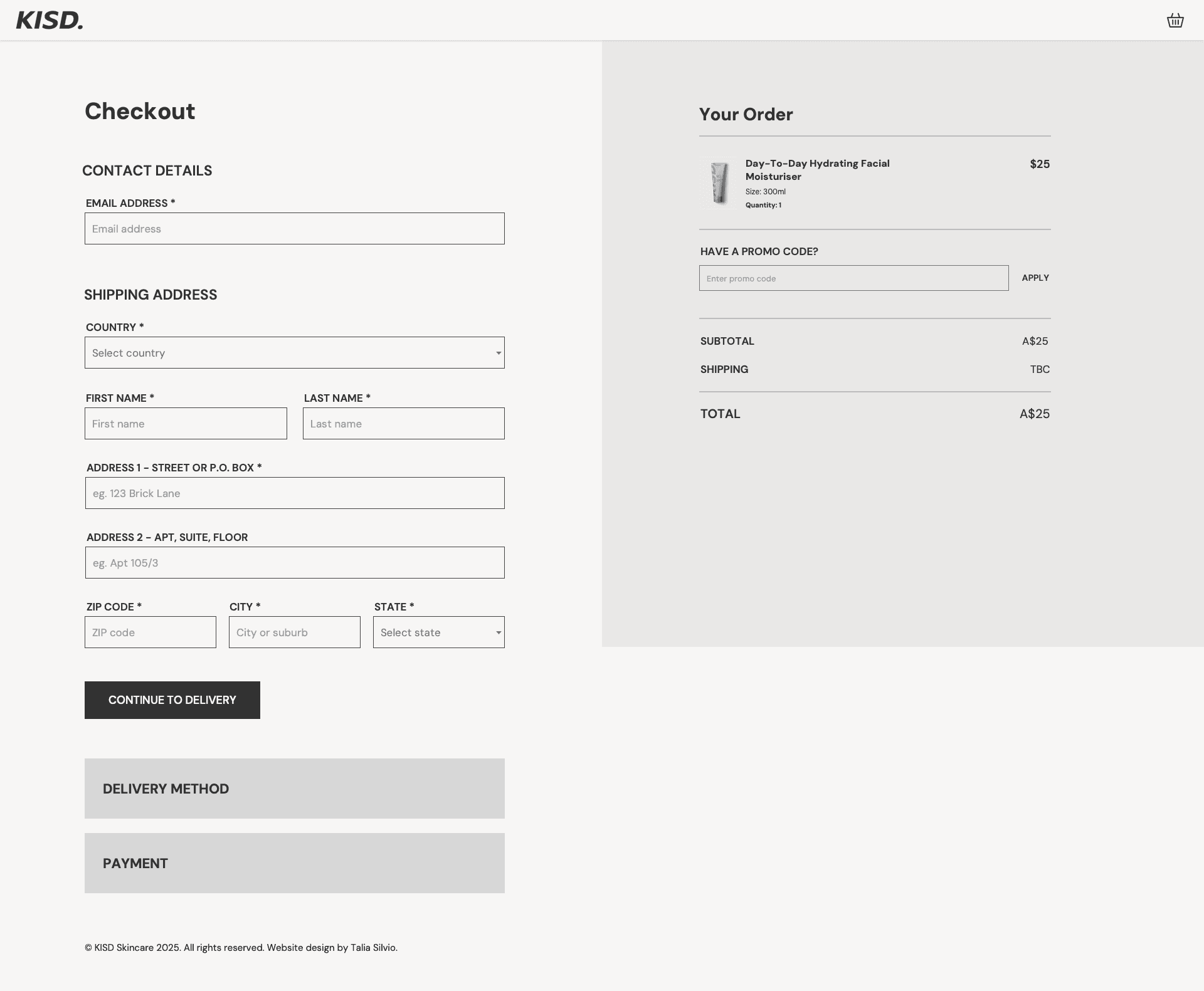
Checkout
Checkout
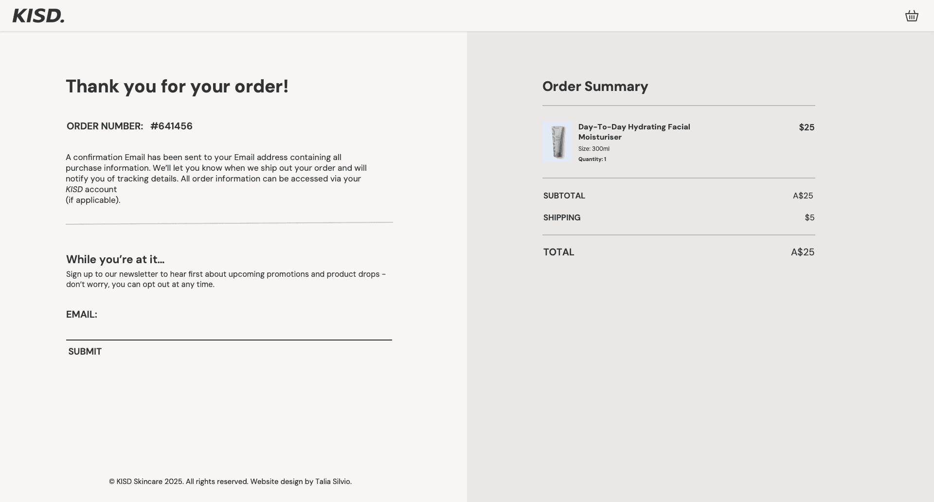
Order Confirmation
Order Confirmation
Product page
Checkout
Order Confirmation
Heuristic Testing
Heuristic Testing
Heuristic Testing
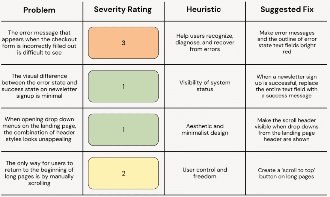
After completing the first iteration of my design, user testing was conducted using Jakob Nielson’s Ten Usability Heuristics for User Interaction Design. An evaluation form was completed by both myself and a peer to review my desktop designs and provide feedback.
After completing the first iteration of my design, user testing was conducted using Jakob Nielson’s Ten Usability Heuristics for User Interaction Design. An evaluation form was completed by both myself and a peer to review my desktop designs and provide feedback.
Usability Reports
Usability Reports
Usability Reports
Peer Review
Peer Review
Self Review
Self Review
Heuristic Redesign
Heuristic Redesign
Heuristic Redesign
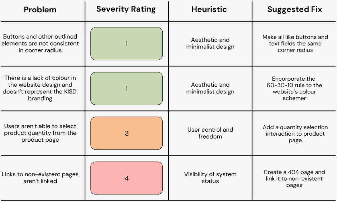
After summarising results from heuristic testing, I began redesigns to address the issues found. Fixing the problems with a low severity rating helped to make the aesthetic design of my prototype more cohesive and build a stronger brand identity, while rectifying higher-severity problems aids site navigation and user control.
After summarising results from heuristic testing, I began redesigns to address the issues found. Fixing the problems with a low severity rating helped to make the aesthetic design of my prototype more cohesive and build a stronger brand identity, while rectifying higher-severity problems aids site navigation and user control.
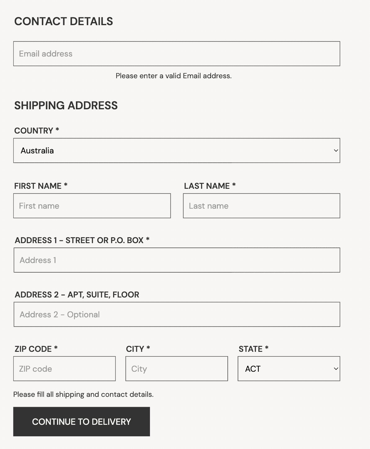
Checkout form error message
Checkout form error message
Checkout form error message
Making the error state of forms red in colour makes errors clearer to users and suggests fixes for this.
Making the error state of forms red in colour makes errors clearer to users and suggests fixes for this.
Before
Before
Before
After
After
After
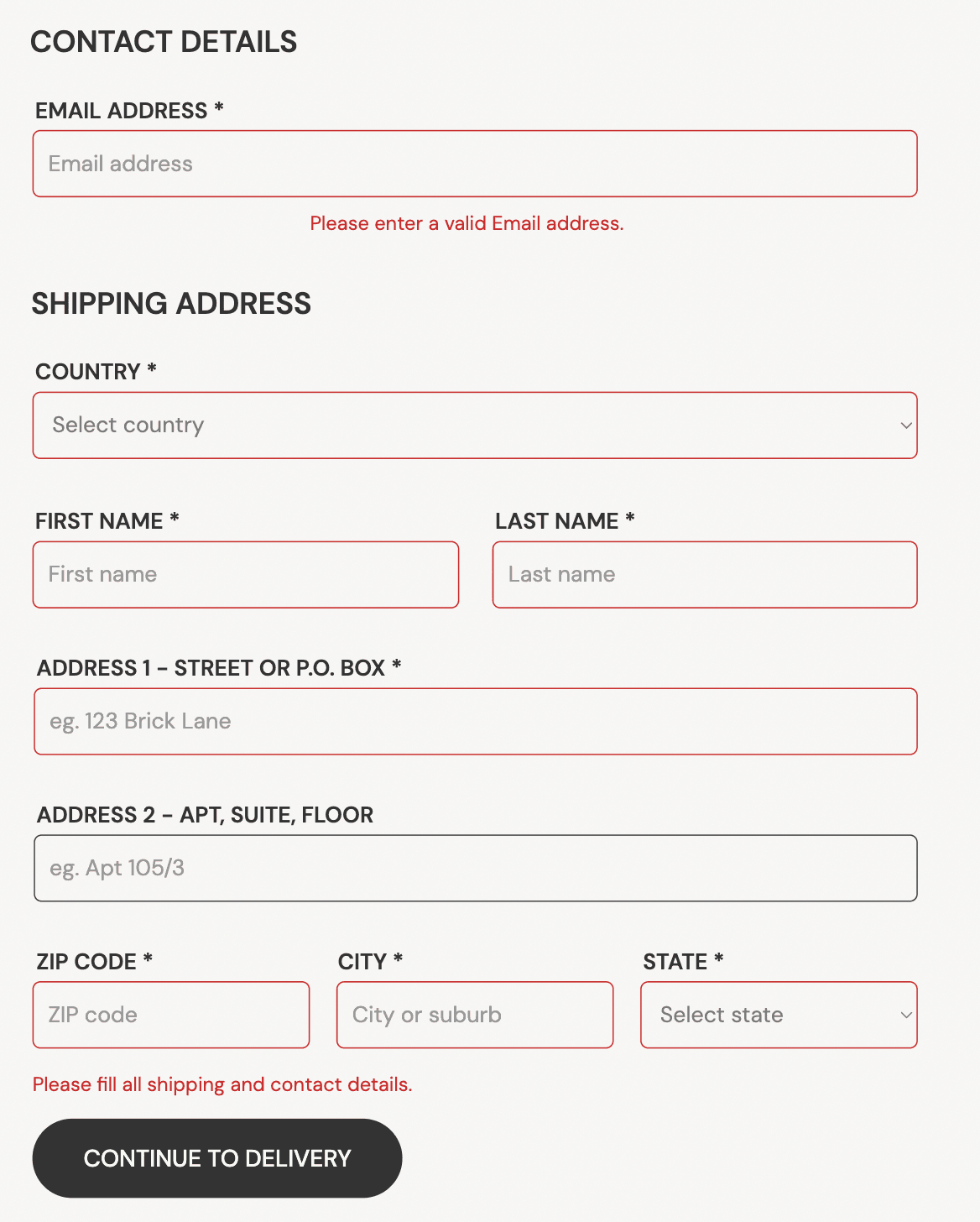
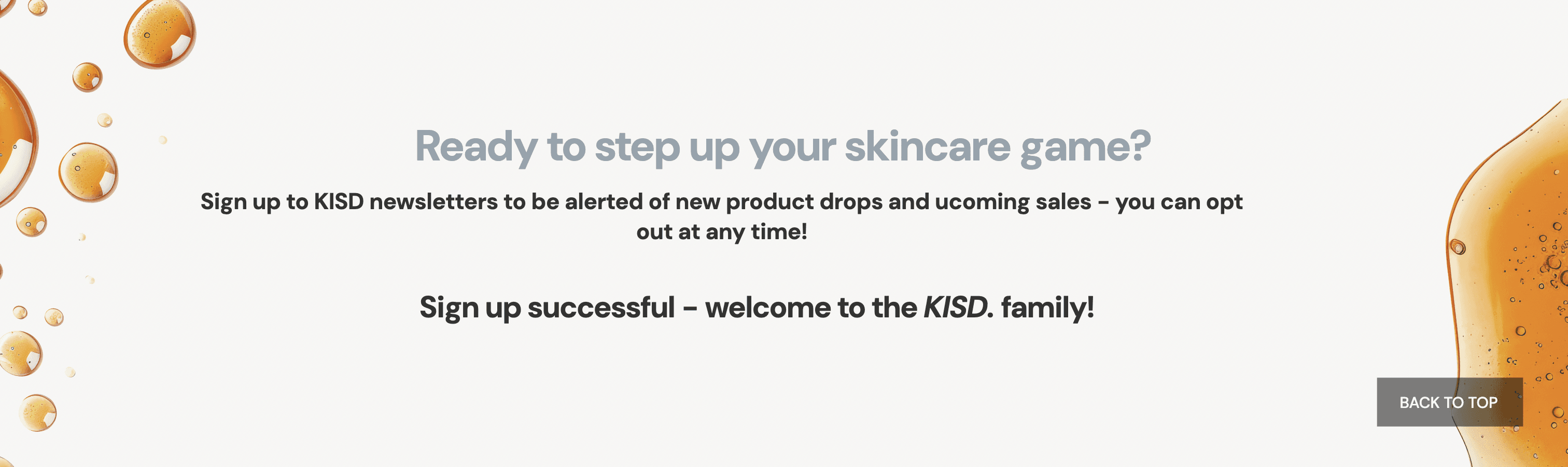
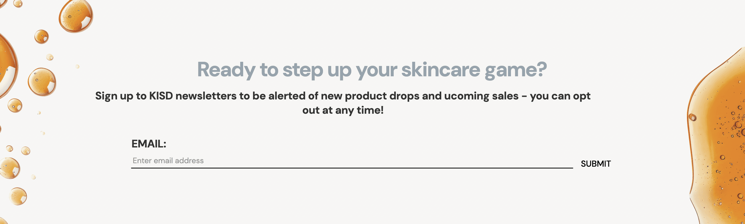
Newsletter signup
Newsletter signup
Newsletter signup
Replacing the text input with a success message makes the user's sign up status clear.
Replacing the text input with a success message makes the user's sign up status clear.
Before
Before
Before
After
After
After

Mismatch of header styles
Mismatch of header styles
Mismatch of header styles
Avoiding the combination of multiple header styles increases visual aesthetics and visual grouping of information.
Avoiding the combination of multiple header styles increases visual aesthetics and visual grouping of information.
Before
Before
After
After
'Back to top' feature
'Back to top' feature
'Back to top' feature
Including a 'back to top' button on longer pages allows users to return to the beginning of a page with minimal effort.
Including a 'back to top' button on longer pages allows users to return to the beginning of a page with minimal effort.
On home page
On home page
Button
Button

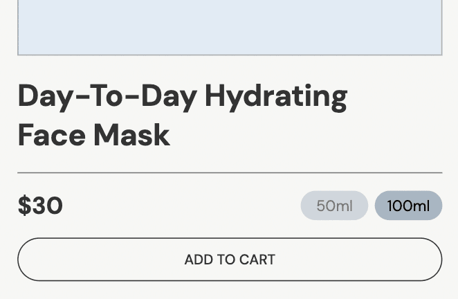
Corner radius redesign
Corner radius redesign
Corner radius redesign
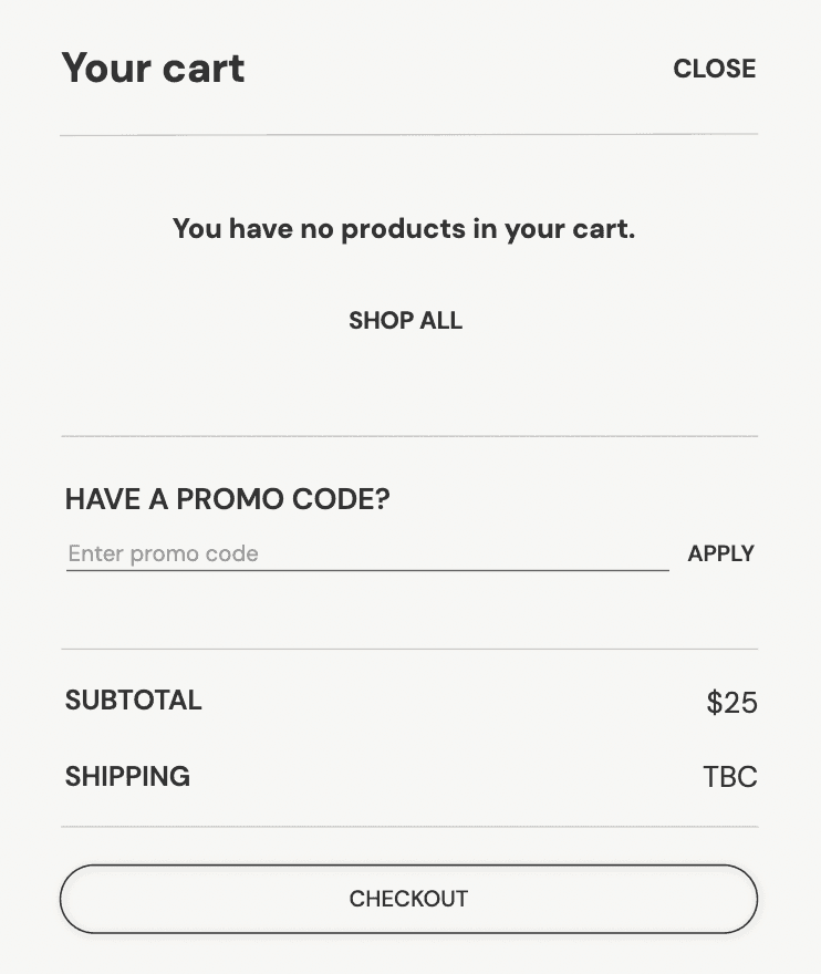
The corner radius of multiple buttons were changed to be cohesive across the website.
The corner radius of multiple buttons were changed to be cohesive across the website.
Before - product card
Before - product card

After - product card
After - product card
Before - cart
Before - cart
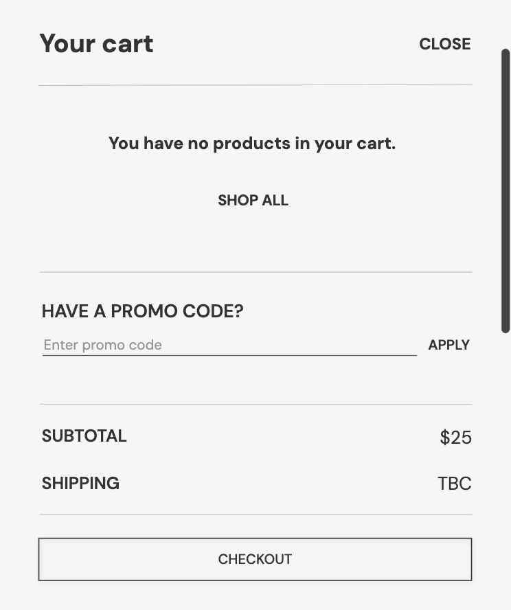
After - cart
After - cart
Before - checkout
Before - checkout
After - checkout
After - checkout
Colour palette
Colour palette
Colour palette
A 60-30-10 colour palette was implemented to add more colour to the site.
A 60-30-10 colour palette was implemented to add more colour to the site.
Before - product page
Before - product page
After - product page
After - product page
Before - newsletter signup
Before - newsletter signup
After - newsletter signup
After - newsletter signup
Promotional header design - mobile
Promotional header design - mobile

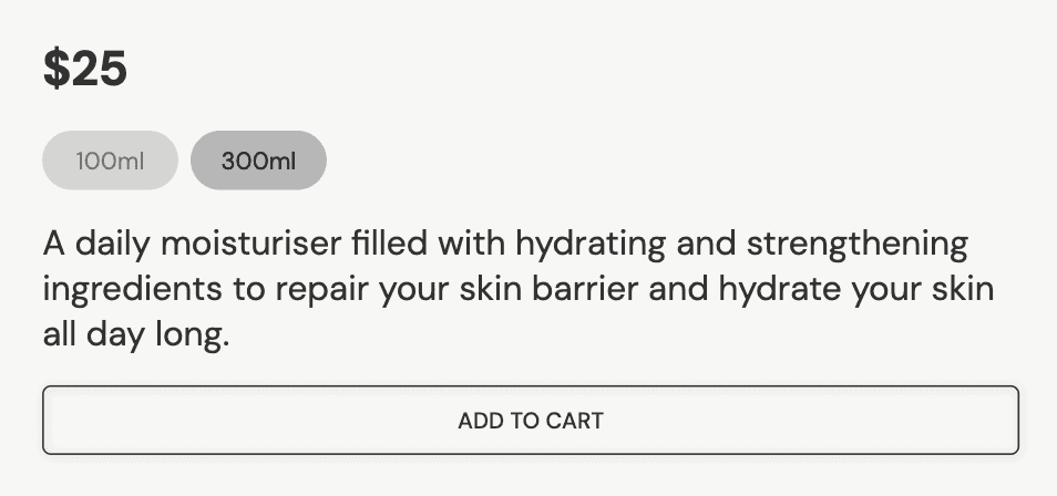
Quantity selection
Quantity selection
Quantity selection
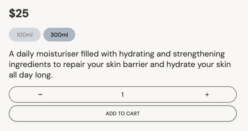
A quantity selection was added on product pages to allow users to select the quantity of an item they wish to add to their cart.
A quantity selection was added on product pages to allow users to select the quantity of an item they wish to add to their cart.
Before
Before
After
After
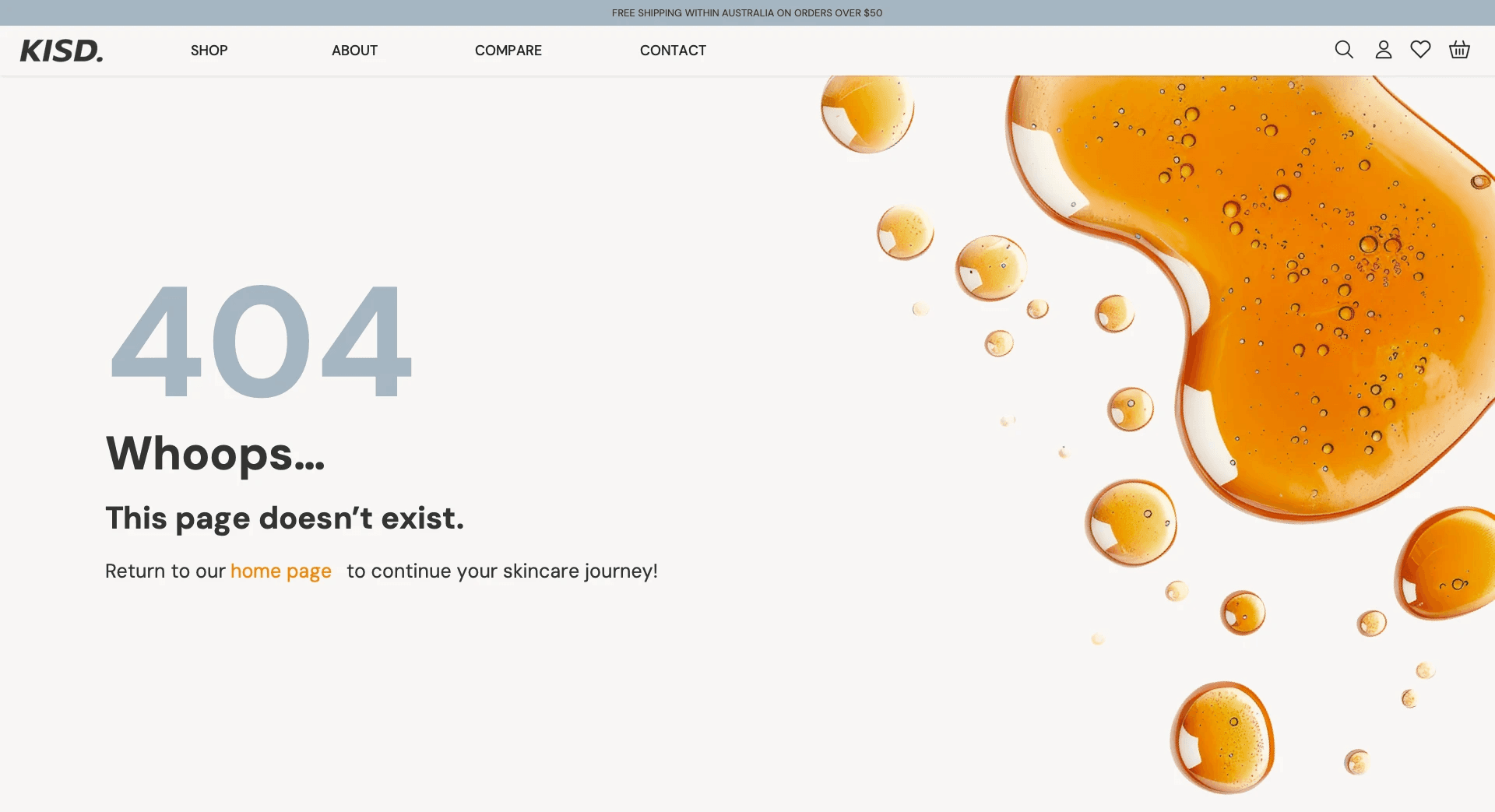
404 page design
404 page design
404 page design
A 404 page was created and linked to undesigned pages.
A 404 page was created and linked to undesigned pages.
Mobile
Mobile

Desktop
Desktop
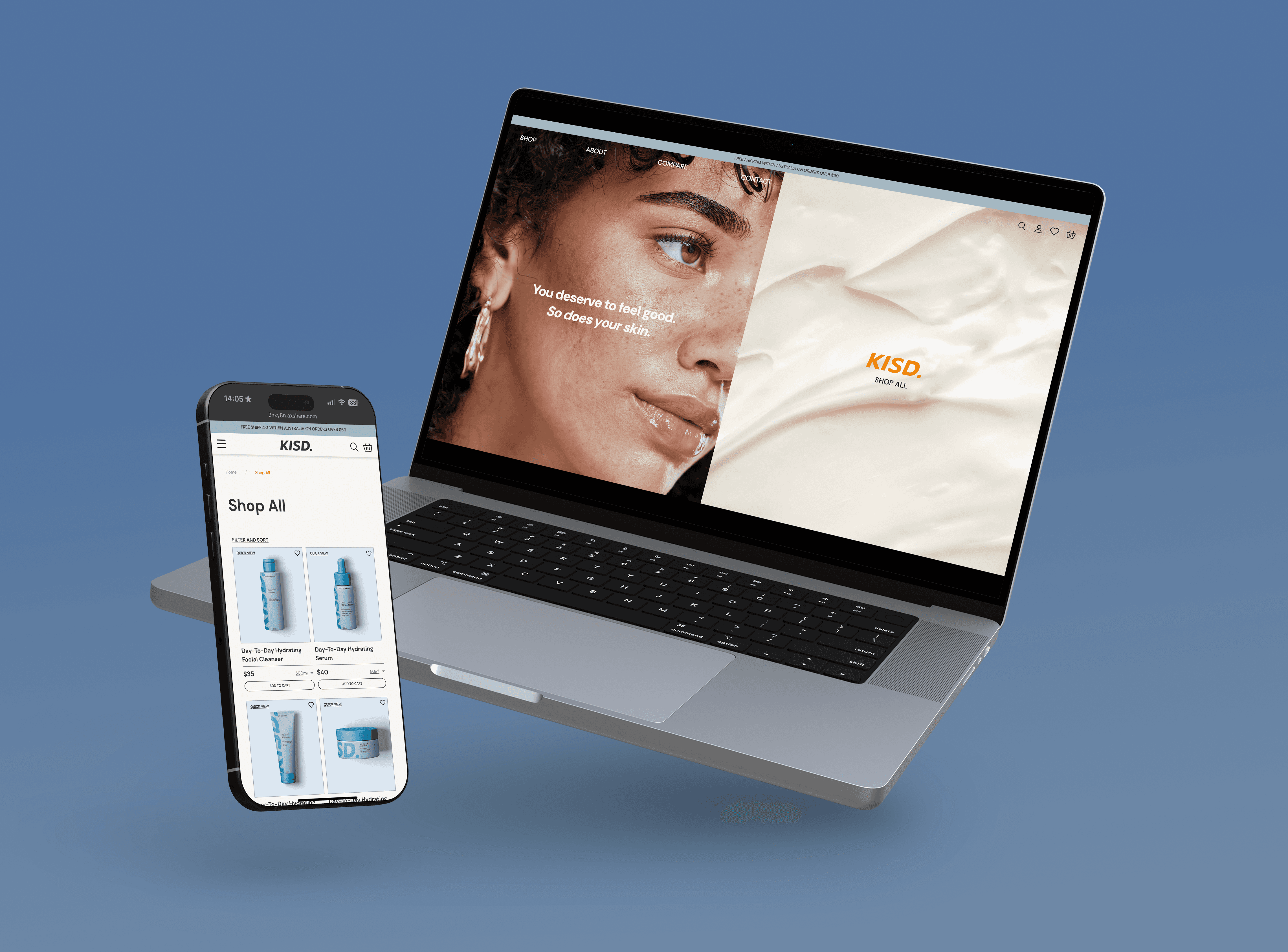
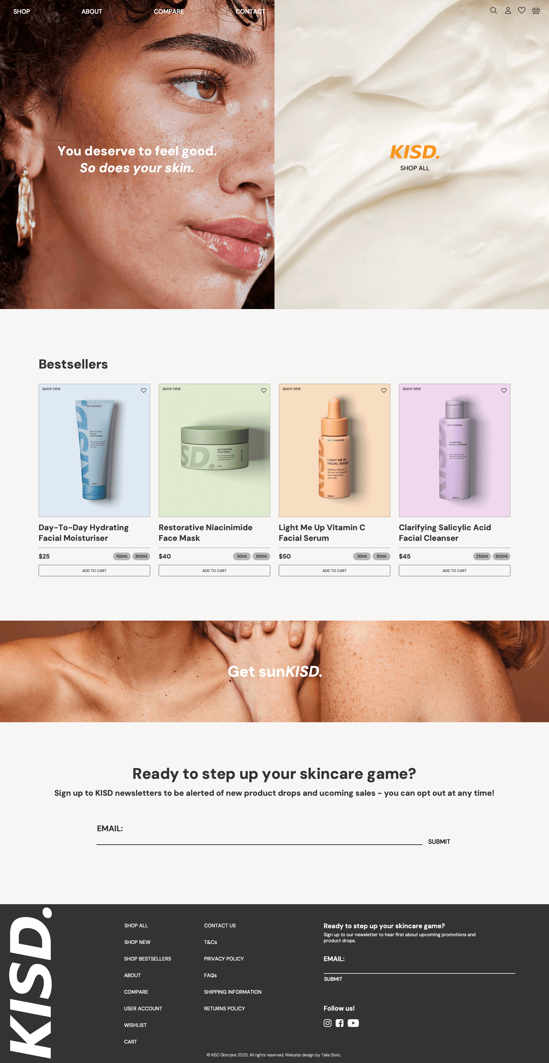
Final Designs
Final Designs
Final Designs
Mobile
Mobile
Mobile

Home and navigation
Home and navigation
Home and navigation
Shop all and quick view
Shop all and quick view
Product page
Product page
Product page
Compare
Compare
*Please note that the mobile compare feature is not fully functional due to file size limits
Checkout
Checkout

404 screen
404 screen
Desktop
Desktop
Desktop

Home and navigation
Home and navigation
Home and navigation
Shop all and quick view
Shop all and quick view
Shop all and quick view
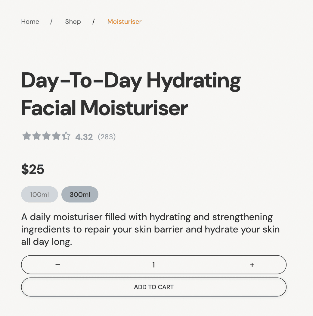
Product Page
Product Page
Product Page
Compare
Compare
Compare
Checkout
Checkout
Checkout

404 screen
404 screen
404 screen
What I Learnt
What I Learnt
What I Learnt
The importance of testing
The importance of testing
The importance of testing
Using heuritstics to assess the effectiveness of my prototype was a key step in refining my prototype. This was my first experience in testing my prototypes, and it showed me the benefits of doing so. Ultimately, changes made as a result of testing feedback enhanced my design in aesthetics and usability.
Using heuritstics to assess the effectiveness of my prototype was a key step in refining my prototype. This was my first experience in testing my prototypes, and it showed me the benefits of doing so. Ultimately, changes made as a result of testing feedback enhanced my design in aesthetics and usability.
Preparation is Key
Preparation is Key
Preparation is Key
Allowing more opportunities for colour and image to be used within my prototype would help with creating a stronger brand identity overall. Being more aware of proper web design practices, such as optimising images and maintaining a low file size in the future, will reduce issues with exporting my prototype, an issue that was faced in the completion of this project.*
Allowing more opportunities for colour and image to be used within my prototype would help with creating a stronger brand identity overall. Being more aware of proper web design practices, such as optimising images and maintaining a low file size in the future, will reduce issues with exporting my prototype, an issue that was faced in the completion of this project.*
*Due to issues with file size and publishing my prototype, the ‘compare’ page on mobile view is not fully interactive.
References
Nielsen, J. (1994, April 24). 10 Heuristics for User Interface Design. Nielsen Norman Group. https://www.nngroup.com/articles/ten-usability-heuristics/
References
Nielsen, J. (1994, April 24). 10 Heuristics for User Interface Design. Nielsen Norman Group. https://www.nngroup.com/articles/ten-usability-heuristics/